As a Executive Creative Director at Semi Permanent my team and I collaborate with brands and organisations in order to help them express themselves on film, in animation across print, and in physical spaces.

I have over 20 years of experience working with large brands through global and local branding agencies such as Collider, Interbrand, R/GA and M&C Saatchi.

Below are five aspects of the design process that are important to me.


The Australian Brandenburg Orchestra is the worlds leading baroque orchestra, led by conductor Paul Dyer. We have over the last 18 months been working on changing all aspects of their brand. And adding movement has been the biggest change.

Making it move.


We wanted to bring motion to the brand, first and foremost. The demand to bring movement and liveliness to brands in general is increasing, so we always think motion first when we come up with ideas around key art for performances. This allows us to create artwork that can find multiple expressions around the same theme, allowing us to not get stuck on one key visual for all the different outputs.


All work was done together with Andrew van der Westhuyzen at Collider.
Houdini animator was Hugh Carrick-Allan and the producer was Hoss Ghonouie. The Director of the 2023 season launch film was Michael Hili.


Blending the digital with the physical.

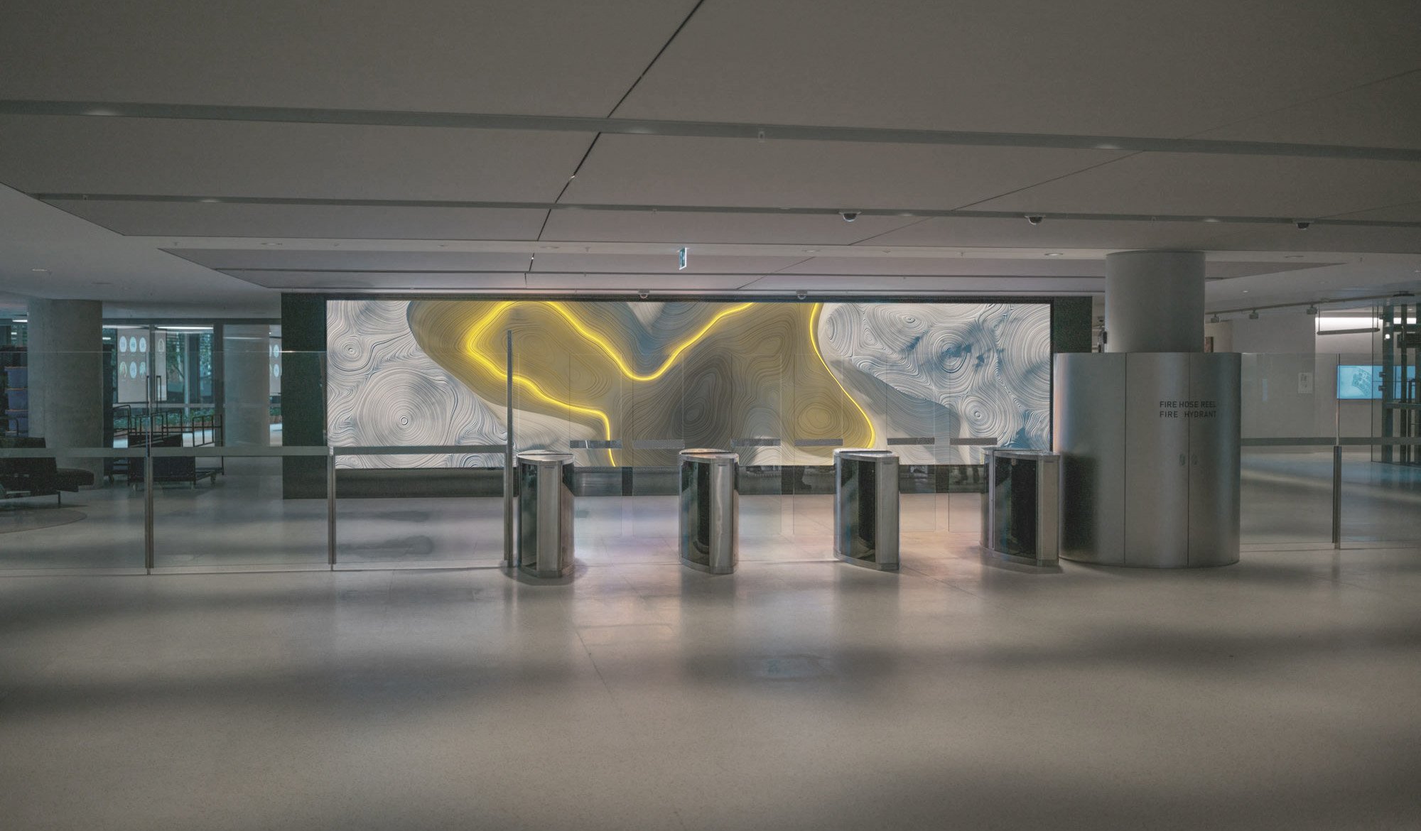
We were asked to create both digital and physical installations in the foyer of the new Commonwealth Bank Headquarters at Barangaroo in Sydney. The foyer, designed by Hassell, features two areas devoted to the function of ongoing curative zones; a 10m LED wall and seven enclosed display cabinets.


On the ground foyer entry we worked with CommBank’s Archives team to curate an richly immersive exhibition that was designed to work across the seven box formats and illustrate some important moments in the technological advancement in Commonwealth Banks history..

We used a combination of physical props, moving animatronics and screen animation to communicate the main feature of each technological era.


All work was done together with Andrew van der Westhuyzen at Collider.
Houdini animator was Hugh Allan-Carrick. Producer was Hoss Ghonouie.
Animatronics done by Brad and Simon at yipeekiyay.


As visual communicators, we can sometimes tie ourselves in knots with our well-meaning visual metaphors. But some projects just need some well-chosen words.

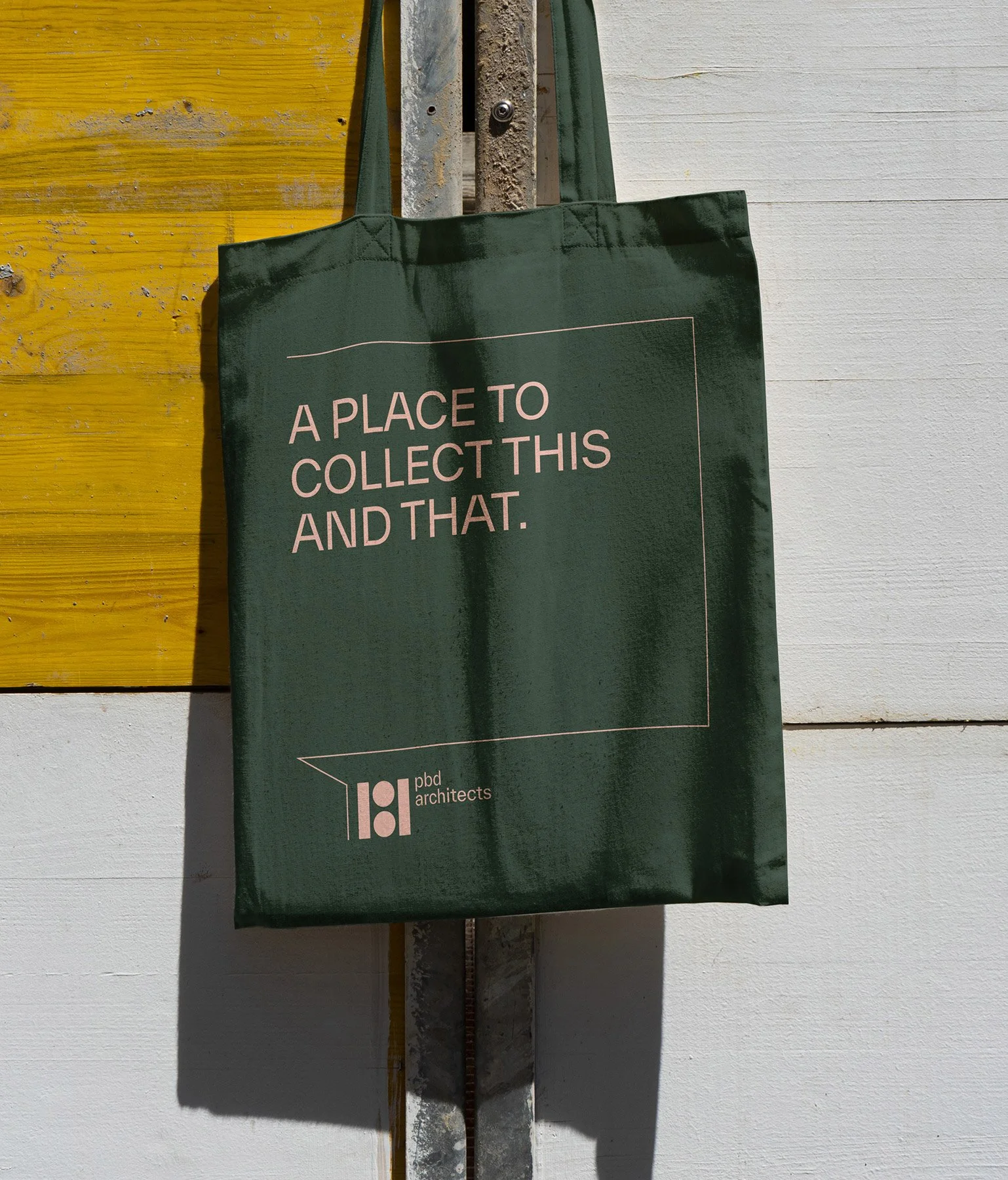
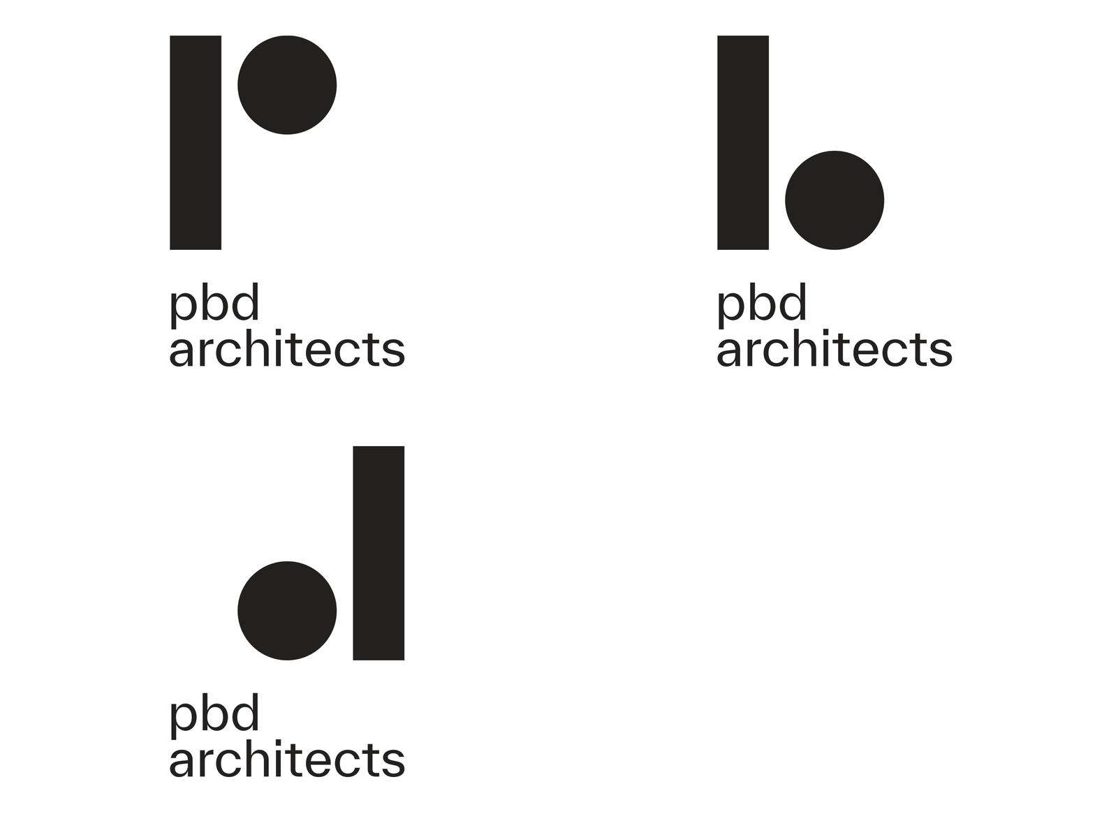
After a thorough workshop with Pbd Architects we realised a lot of what was not working out for them was the language and the tone of the words. A good typeface, some good words, some space and some colours was what they needed in order for them to soften their image.


Use your words!

All work was done at Collider.Producer was hoss Ghonouie.
Houdini animator was Hugh Allan-Carrick.


Keep it simple. Or don’t. (But no hanging out in the middle).


I generally like to boil things down so that we are left with just the most effective elements that tell the story. But sometimes just being loud is the story, so then we just go with being loud.

Left: Book cover for Vigmostad & Bjørke, Norway.
Right: Book design for telecom Belong, Australia.
Done at Collider together with Andrew van der Westhuyzen.

An example of being loud is the Book of Limbo. It was done on behalf of the progressive carbon neutral telco, Belong. The brief was to manifest the concept of a digital wormhole in book form.

It won a wooden pencil award at the D&AD Awards in 2022. Below is a small ‘Making of’ film.


Although I firmly believe that we can’t analyse and rationalise ourselves to a great creative outcome, a good strategic foundation can certainly take us halfway there. At a certain stage in the process though it’s important to leave the right side of the brain behind and go exploring in our intuition and let coincidences and perhaps a touch of magic take us all the way there.

The branding job for Scandinavian light designer House of Holmedal is one such example. At one stage in the process we just felt that something had to break the standard ‘nice Scandinavian design’ trope.

Strategy vs intuition.


Done at Collider together with Andrew van der Westhuyzen.